This article contains affiliate links. If you buy through them, we may earn a commission at no extra cost to you.
Why Color Coordinating Your Accessories Matters
Getting dressed is so much more than pulling on a great outfit — the accessories you choose can make or break the entire look. Color coordinating your accessories with your outfit is one of the most powerful styling tools at your disposal. When done well, it creates a sense of harmony, sophistication, and intentionality that transforms even the simplest ensemble into something truly polished.
Whether you are a minimalist who loves a monochrome moment or a maximalist who thrives on bold colour clashes, understanding a few key principles of colour coordination will help you dress with confidence every single day.
Understanding the Colour Wheel
Before you start pairing accessories, it helps to have a basic understanding of colour theory. The colour wheel is your best friend when it comes to building cohesive outfits.
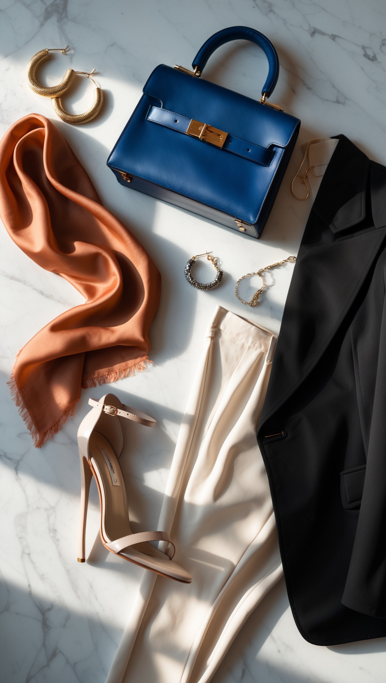
- Complementary colours sit opposite each other on the wheel — think blue and orange, or red and green. These pairings create vibrant, eye-catching contrast.
- Analogous colours sit next to each other — such as yellow, yellow-green, and green. These combinations feel naturally harmonious and effortless.
- Triadic colours are evenly spaced around the wheel — like red, yellow, and blue. This approach creates a lively, balanced look.
Once you understand these relationships, you can apply them to everything from choosing a handbag to picking the right jewellery pieces to complement your dress.
The Power of Neutrals
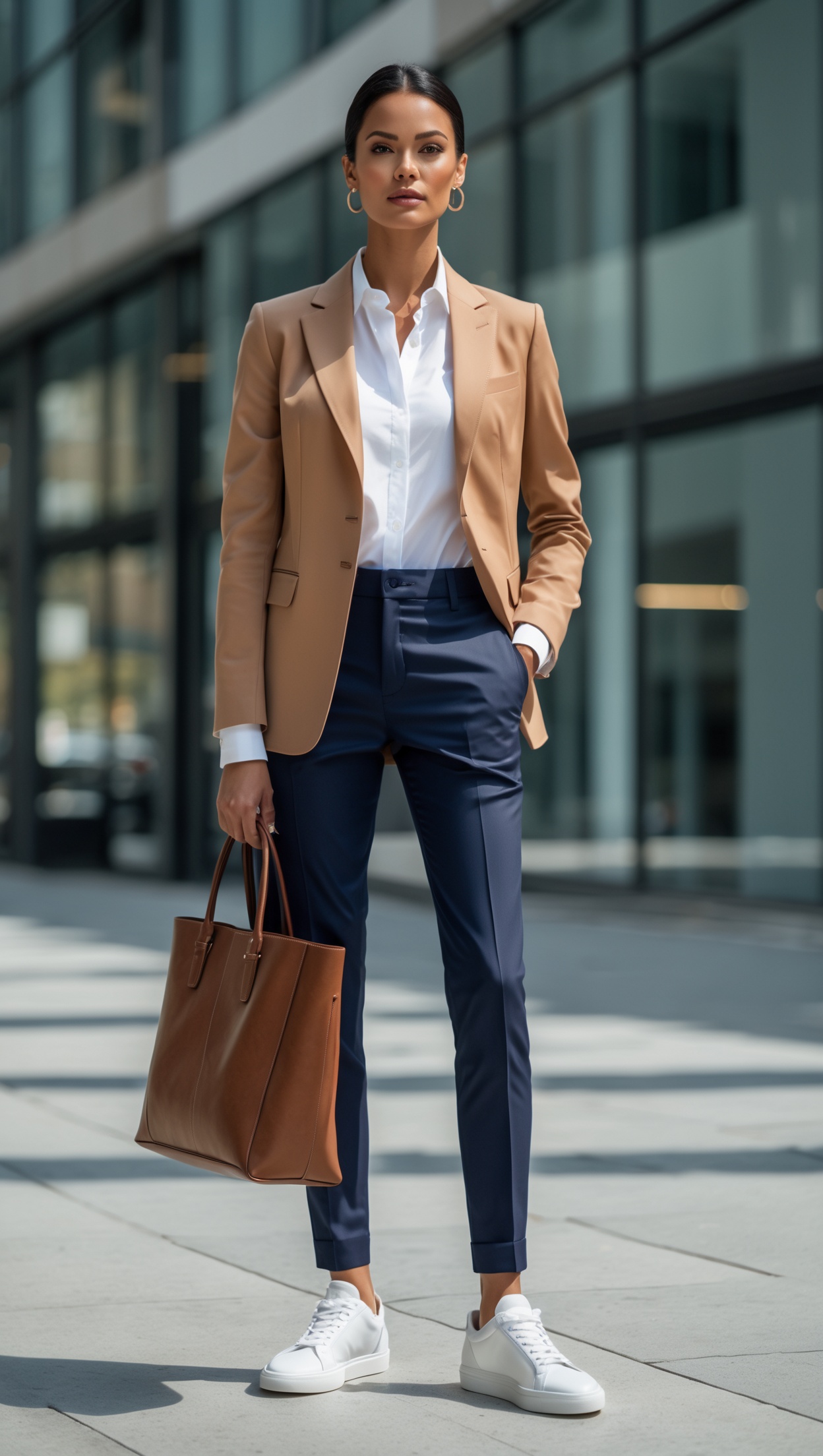
If colour theory feels overwhelming, neutrals are your safest and most versatile starting point. Black, white, cream, beige, grey, camel, and navy are the building blocks of a coordinated wardrobe. Neutral accessories can be paired with virtually any outfit without clashing.
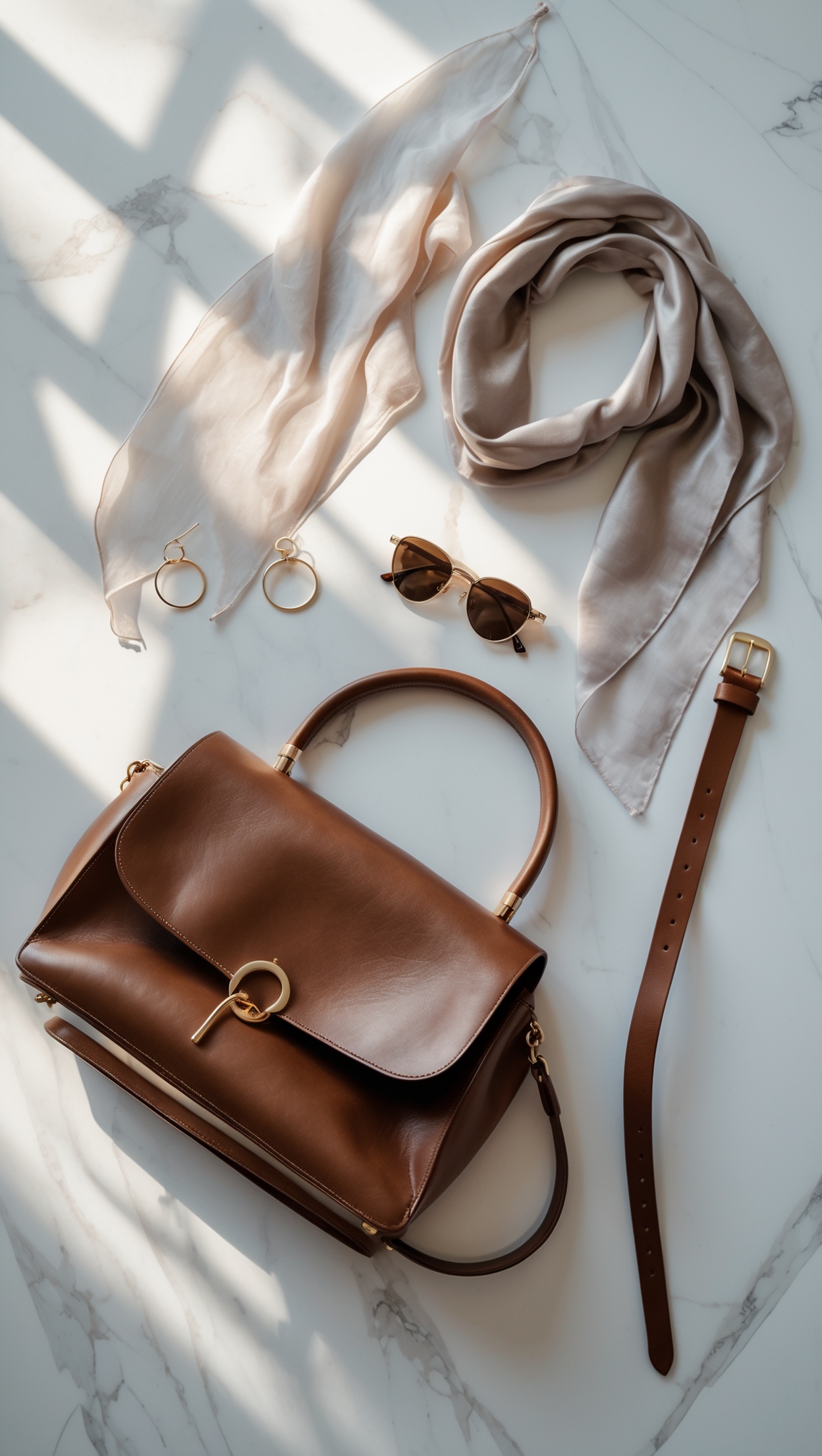
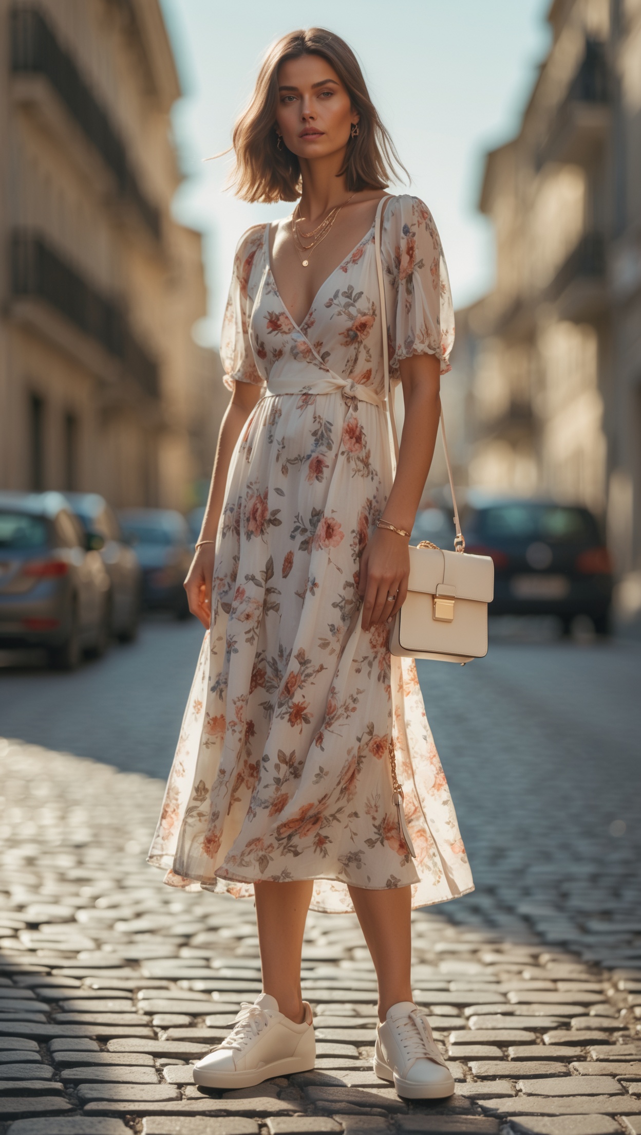
For example, a camel leather belt will warm up a grey trouser suit beautifully, while a white structured bag instantly freshens up a navy summer dress. Neutral-toned shoes and bags from elegant collections — such as those found at Tara-M — are wardrobe staples that deliver endless versatility.
The key with neutrals is to pay attention to undertones. A warm beige accessory may clash slightly with a cool-toned grey garment, so learning to distinguish warm and cool neutrals is a small but significant skill.
Monochromatic Dressing
One of the most stylish and foolproof approaches to accessory coordination is the monochromatic look — dressing entirely in one colour or varying shades of that colour from head to toe.
For instance, pairing a dusty rose blouse with blush trousers and adding rose-gold jewellery and a mauve clutch creates a beautifully layered tonal outfit. This technique is especially striking in earthy tones like terracotta, rust, and tan, or in cool palettes like cobalt blue and periwinkle.
When shopping for pieces to build a tonal wardrobe, the curated collections available through Peter Hahn offer sophisticated, timeless options across a broad range of colour families — perfect for mastering the monochromatic look.
Using Statement Accessories as Colour Anchors
A statement accessory — a bold handbag, a striking scarf, or a pair of vibrant shoes — can serve as the colour anchor for your entire outfit. The idea is to build your look around that one standout piece.
Say you have a bright cobalt blue shoulder bag you love. Pair it with a crisp white outfit and let the bag be the hero. Then, pull one subtle accent from the bag's colour into a smaller accessory — a blue hair clip or a lapis bracelet — to tie the look together without overdoing it.
For unique, hand-crafted jewellery pieces that make the perfect colour anchor, La Joya Jewelry offers beautifully designed collections that span everything from bold coloured gemstones to delicate gold-toned pieces.
Metal Tones and Jewellery
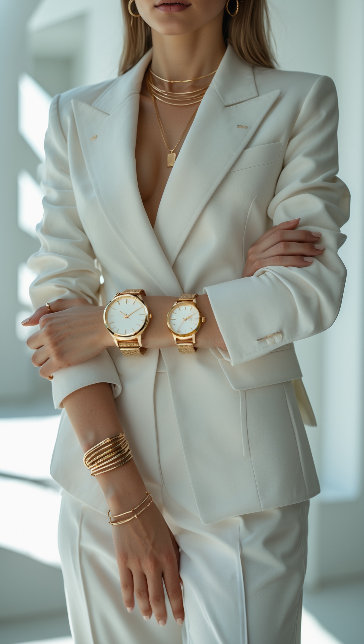
Do not overlook the importance of metal tones when colour coordinating your accessories. Gold, silver, rose gold, and oxidised metals each carry their own colour temperature and can dramatically shift the feel of an outfit.
- Gold jewellery pairs beautifully with warm tones like rust, olive, mustard, and burgundy.
- Silver jewellery complements cooler tones such as grey, cobalt blue, lavender, and crisp white.
- Rose gold is wonderfully versatile and works particularly well with blush, nude, and dusty pink palettes.
Mixing metals can absolutely work, but keeping it intentional is key. Layering a fine gold necklace with a silver cuff can look effortlessly chic if the rest of your outfit is kept simple. For an exciting range of on-trend jewellery in every metal tone, CRONJAGER offers beautiful, fashion-forward pieces that elevate any look.
Colour Coordination for Footwear
Shoes are often an afterthought, but they play a crucial role in completing a colour-coordinated outfit. A few simple rules can guide your choices:
- Match your shoes to your bag for a classic, polished effect — especially in neutrals like black, nude, or tan.
- Echo a colour from your outfit in your shoes to create a subtle thread of colour that runs through the look.
- Use contrasting colour shoes to add a pop of personality to a neutral outfit.
For those who love statement footwear, House of Sneakers carries an incredible range of bold, colourful sneakers and shoes that can serve as the starting point for an entire colour-coordinated look. Build your outfit from the shoes up — it is a fun and creative way to style yourself.
Scarves, Belts, and Small Accessories
Do not underestimate the impact of smaller accessories like scarves, belts, hats, and sunglasses. These pieces are the fine-tuning tools of a well-coordinated outfit.
A silk scarf in a complementary colour can tie together separates that might not otherwise feel cohesive. A bold belt in a contrasting hue can define the waist while adding a striking colour moment. Even the colour of your sunglasses frames matters — tortoiseshell works with warm palettes, while sleek black or silver frames suit cooler tones.
For beautifully designed accessories that blend aesthetics with function, Design Letters offers a stylish range of pieces that bring a touch of Scandinavian design sensibility to your wardrobe essentials.
Seasonal Colour Palettes
Thinking in seasonal palettes can simplify the process of colour coordinating accessories enormously. Each season naturally lends itself to a distinct set of tones:
- Spring: Pastels, soft florals, mint green, blush pink, and lilac.
- Summer: Bold brights, coral, turquoise, sunny yellow, and crisp white.
- Autumn: Rust, burnt orange, camel, forest green, and chocolate brown.
- Winter: Deep jewel tones, burgundy, midnight blue, emerald, and classic black.
By aligning your accessory choices with the current season's palette, you naturally create a cohesive and on-trend look without having to overthink every pairing.
Where to Shop
Looking for a smart and seamless way to discover fashion inspiration and connect with your audience? Manychat is a brilliant tool for fashion creators and boutiques looking to engage followers and share styling tips automatically via social media. It is a game-changer for anyone building a style-focused community online.
For a touch of luxury and high fashion, MINOX offers an exclusive boutique experience with premium pieces. For even more fashion inspiration and outfit ideas, Voghion offers thousands of on-trend pieces at great prices.